Developers log, game date 20250717.5. Some boards are as simply as can be: a blank sheet of paper to write words and scores. A blank square or hex grid. Others are massively complex, like those from Risk, Terraforming Mars, Wingspan. And then there are boards that are just colorful, even though they’re fairly straight-forward: Outburst, Taboo, and so on.
For Spore-adic, I have a few goals:
- Colorful and fun, to match the vibe of the characters and game overall.
- Clear where the available spaces are.
- Easy to understand the board usage (different game setups).
In the first version, I just had a hex grid with a black border of hexes indicating the edge of the board. To determine the size of the board, I had to balance the number of players, spaces, and the rate at which pieces would be added to be board. The game was originally designed for six players, placing 2-3 pieces per turn (with some pieces being removed by cards). That means approx. 15 pieces per turn added to the board. If the each player takes 20 seconds for their turn, a round would be approx. 2 minutes. If I wanted to have the game be about 10 rounds, then I’d need a board that supported some 150 on the high end.
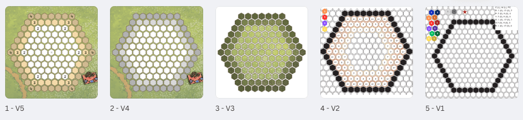
Since the game wouldn’t use all the tokens – we wanted the players to compete for space – I needed a board that would have fewer spaces than the number of tokens that would be placed in 10 rounds. A grid with 8 hexes per side has 169 spaces, and a grid with 7 hexes has 127 spaces. So, I went with 127. That gave me the first board (see above on the right).
As I started to play, I realized for 2 and 3 players, the board was just too big. You could place all your tokens and never interact. Even for 4 players, you wouldn’t end up with the board filled. So now 4-player games would place 3-4 tokens per turn, and 2 and 3 players would have a slightly smaller board, starting one or two spaces in from the border. This allowed the board to fill at the correct rate, with a good amount of interaction, and limited space (so you’d have to compete for available space).
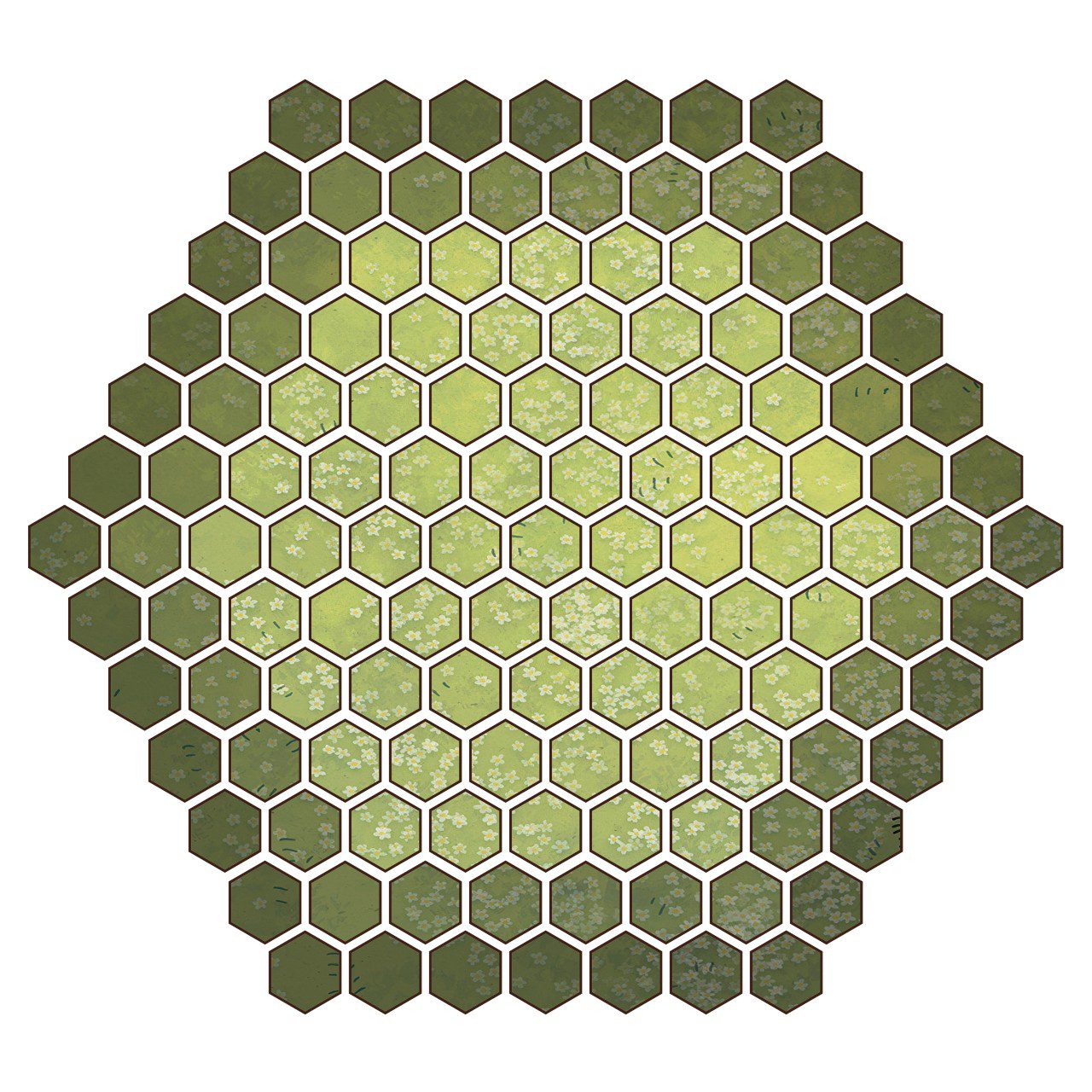
Now that I had a good board size, and a way to narrow the game board for each of the different player counts, I needed something more visually appealing than a big hex grid. I used the grid as a starting point and built a grass field graphic behind the open grid. This had a nice vibrant look, but I ran into two problems: first, the green and yellow tokens I 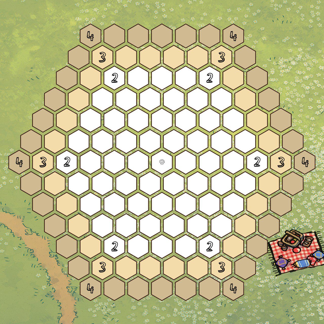 made were really difficult to see. Second, the colorful board was being covered up with colorful pieces, so at the end of the game you just saw the white border. That… was not what I wanted. Back to the drawing board (no pun intended).
In the next version, I inverted the mask on the board, making the garden the outside, which allowed the open spaces of the board to be clearly visible while playing. I used dark grey and light grey hexes to indicate the 4 and 3 player board edges. This was helpful, but still not visually appealing or very indicative. I proceeded to add numbers, changed the colors to a brown and tan (more in keeping with the color schemes) and added a tiny mushroom icon to indicate the center of the board. Tossing tokens closest to the center of the board is what determines who goes first, so it needed to be clear where the center was.
And finally, we get a vibrant, fun looking board, where the blank spaces are visible, and the player setup is mostly indicated on the board itself, without overloading the board content. Even as the board filled with pieces, it still had a colorful, fun feel, and gave the illusion that the game was filling up a garden.
Next up: the tokens.